10+ years designing fintech, banking and enterprise products for millions of users — from RAKBANK in Dubai, to secure travel for 1.5M+ Amazon employees, to developer tooling at Intuit.
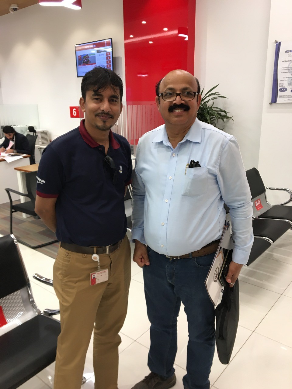
My journey into design wasn’t a straight path — built on curiosity, problem-solving, and a desire to create impact. During my MBA at IBS Ahmedabad, I co-founded KitaabMarket — my crash course in understanding where design meets business.
Wearing multiple hats — founder, strategist, marketer and designer — taught me that great design isn’t just about aesthetics; it’s about solving real problems.
Eliminated YAML barriers for 1,000+ Intuit developers — designing a dual-path metric builder that reduced MTTR by 30% and drove 60% adoption growth in 3 months.
Turned a 36-hour ordeal into a 15-minute experience — redesigning SGT booking for 1.5M+ employees traveling to high-risk locations worldwide.
Designed the Gulf’s first smart business spend platform for freelancers and SMEs — from zero to funded startup in 18 months.
Design is a verb, not a deliverable. Every project follows the same north star: understand deeply, design deliberately, validate ruthlessly.
From stakeholder interviews to post-launch analytics — STRIDE is the framework that keeps me grounded when requirements shift and timelines compress.
Deep qualitative & quantitative research, interviews, contextual inquiry.
Insights into clear problem statements and opportunity spaces.
Wireframes, visual design, and high-fidelity prototypes tested with real users.
Via usability testing and continuous improvement based on real feedback.
Final design to engineers with meticulous handoff — I collaborate until launch.
Post-launch using UX metrics and analytics to drive continued improvement.


Beyond what’s captured in case studies — there are challenges, failures, and breakthroughs that shaped each project. I’d love to share the full story.
zohdi.rizvi@gmail.com
Amazon · UX Designer II · 2022–2023How I redesigned Amazon’s Secure Ground Transportation booking — turning a 36-hour approval ordeal into a 15-minute flow for 1.5M+ employees traveling to high-risk locations worldwide.
Amazon employees travel everywhere — including politically unstable regions, active epidemic zones, and areas with severe weather risks. When a VP needs to reach a supplier in Lagos or a data center in Nairobi, they need a vetted, secure ground transportation provider from wheels-down to wheels-up.
That service existed. It was called SGT — Secure Ground Transportation. The problem: the product built to access it was so broken that employees avoided it entirely — using personal arrangements instead and putting themselves at real risk.
“I submitted the form on Monday. It was approved Wednesday. My flight landed Tuesday night. I waited alone at the airport for 14 hours.”
— Amazon Employee, SGT User InterviewHow might we streamline the SGT booking process so that low-risk requests get instant approvals, travelers always know their status, and TRM can focus only on complex, high-risk cases?
15+ fields. Zero conditional logic. No submission confirmation. No eligibility check upfront. Travelers filled it out blind — often incorrectly. TRM spent hours chasing corrections before they could even begin to triage.
The SGT problem had two distinct users with conflicting needs: travelers who needed certainty and speed, and TRM analysts who needed accuracy and control. Designing for one without the other would fail both.
Travelers submitted and heard nothing for 36 hours. No acknowledgment, no ETA, no eligibility check. The most common support ticket: “Did you even get my request?”
Every traveler saw every field — regardless of destination. 40% of submissions had missing or incorrect info. TRM spent ~2 hours/day chasing corrections before any triage could begin.
All follow-up happened over email and WhatsApp. Provider confirmation was fragile. Miss one email, and you had no way to verify your pickup was still happening.
“I just need to know my driver will be there. Everything else is noise.”
“Half my day is chasing people for information they should’ve given me in the first form.”
80% of SGT requests were low-risk domestic trips that required zero TRM review — but the system forced 100% of requests through the same manual queue. The bottleneck wasn’t capacity. It was routing.
The redesign wasn’t a skin job. It required rethinking the entire approval logic, moving eligibility to screen zero, and building a rule-based auto-approval engine with TRM to handle the 80% of requests that didn’t need human review.
40% of travelers didn’t know if their destination qualified for SGT. Moving the eligibility gate to screen zero eliminated wasted submissions entirely. Rejection surprises dropped to zero.
Low-risk domestic trips: 2-minute flow. High-risk international: additional security fields unlocked. Originally designed with 12 branch conditions — engineering pushed back on scope. I mapped each branch to its drop-off impact and negotiated down to 4 high-impact branches without losing the core benefit.
A persistent status card showing each stage — Submitted → Under Review → Approved → Provider Assigned. Required partnering with TRM to build auto-advancement logic for low-risk requests, reducing manual TRM involvement to ~20% of requests.
Replaced the shared Quip spreadsheet with a risk-sorted request queue. High-risk trips surfaced at top; auto-approved trips removed from view entirely. TRM went from reviewing 100% to ~20% of requests.
From a 36-hour average to under 15 minutes for low-risk trips. Direct result of eligibility-first + progressive form.
Rule-based routing processed 80% of SGT requests without TRM involvement — enabled by the priority-routing redesign.
Friction removal unlocked suppressed demand. Employees who had avoided SGT entirely began using it.
Real-time status eliminated the #1 ticket type — “Did you receive my request?” Measured 6 weeks post-launch.
Travelers land at airports and need to confirm their driver on their phone. I flagged mobile parity in discovery — but didn’t push hard enough when it was deprioritised. I should have returned with usage data, not just a UX argument.
Travelers re-entered trip details already captured in Concur. I accepted this as a technical constraint. In hindsight, a designed auto-fill mockup showing time savings and error reduction could have made the business case for prioritisation.
TRM bulk-action workflows were clunky post-launch — the TRM dashboard was under-tested relative to the traveler flow. I’ve applied this principle in every project since: the back-office user defines whether a product actually works.
The stakeholder debates, the failed iterations, the engineering negotiations, the moments we almost got it wrong — I’d love to walk you through it all.
Xpence · Head of UX · 2019–2021How I led UX from zero to funded launch for the Gulf’s first B2B spend management platform — surviving a full regulatory pivot, building a remote design team from scratch, and shipping a product that reached 5+ markets without a redesign.
In 2019, the UAE’s freelancer and SME ecosystem was booming — but the financial infrastructure for small businesses was surprisingly primitive. Opening a business bank account required AED 25,000–50,000 minimum balance. Most newer companies were turned away within days of applying.
They weren’t failing to manage money. They were failing to access the basic infrastructure to do it legally and at scale.
“It seems to be impossible for a small company to open a bank account in Dubai. I’ve tried four banks. All rejected us within 10 days.”
— Reddit, r/dubai · 2018 · 847 upvotesHow might we help freelancers and SMEs in the Gulf manage business expenses with corporate cards and real-time spend visibility, eliminating manual reconciliation and the need for a traditional business bank account?
Xpence’s original vision: become the “Revolut for the UAE.” Then the regulatory walls appeared. Securing a banking license required 3+ years and AED 150M in capital. We pivoted overnight from neobank to B2B spend management platform.
For design, this wasn’t just a scope change — it was a fundamental reframing. The product had to feel like a bank account for businesses that couldn’t get one. Trust, not novelty, became the primary design objective.
We built a “Coming Soon” landing page and ran targeted PPC ads aimed at people actively searching for business banking alternatives in the UAE. 216 high-intent responses — the best kind of signal.
SMEs didn’t need expense management software. They needed to feel like legitimate businesses. The real design problem was trust, not tracking. Every product decision flowed from this.
Most fintech dashboards open on a balance. We opened on the card — because for Xpence users, the card was the product. For many, it was the first corporate instrument they’d ever had. Putting it front and centre was a trust signal, not a UI preference.
Every layout, component, and typography decision was made with RTL in mind from the first wireframe. Leadership questioned the 2-week overhead. When Phase 2 expanded to KSA and Egypt, the system required localisation only — not a redesign. It saved an estimated 6–8 weeks per market.
Spend analytics had 12% monthly active usage. Receipt capture had 78% task completion. The data was clear: users stayed for capture, not charts. We restructured the entire transaction flow around instant inline capture.
Fintech KYC flows are typically document-dump screens with no feedback. We designed onboarding as a 3-step progress flow with clear milestones, document acceptance status, and card delivery tracking. First-submission approval on both iOS and Android App Stores.
Validated user research and a shipped product contributed directly to securing seed funding. Design de-risked the investor pitch.
RTL-first design system enabled expansion to KSA, Bahrain & Egypt requiring only localisation — saving an estimated 6–8 weeks of redesign per market.
Built a remote design team of 3 at 30% of equivalent agency cost by designing a structured brief and async review process from day one.
Inline receipt capture drove 78% task completion — the core retention metric. Analytics features saw only 12% MAU by comparison.
Agency quality was high but ownership was low. One exceptional in-house designer from day one would have outperformed three capable agency designers over a 12-month engagement.
Research showed mobile as the primary capture device — but underrepresented where the management workflow actually happened. The web app arrived in 2022. It should have been in the MVP.
Leadership questioned the RTL-first investment. When Phase 2 expanded to KSA, every hour paid back 3×. I should have made the ROI case upfront, not waited to be proven right.
Spend analytics: 12% MAU. Receipt capture: 78% completion. The data was clear early — we just didn’t act on it fast enough. Delight built on a shaky core is expensive decoration.
The onboarding flow scrapped 3 days before dev handoff, the pivot that changed everything, the RTL argument I wish I’d made earlier — I’d love to walk you through it all.
Eliminated YAML barriers for 1,000+ Intuit developers — designing a dual-path metric builder that reduced MTTR by 30% and drove 60% adoption growth within 3 months of launch.
Inside Intuit’s engineering organisation, the DevX team owns the internal DevPortal through which thousands of engineers instrument, observe, and manage their services. The problem: creating Prometheus recording rules required hand-written PromQL expressions inside YAML files, committed to a repository, with a deployment wait and zero UI feedback.
Most developers skipped this entirely — pushing raw metrics to Wavefront instead, which cost significantly more and produced less signal.
“I’d rather push raw metrics to Wavefront and deal with the cost later than spend 2 hours debugging a PromQL expression that might be wrong anyway.”
— Intuit Developer, FMH Interview · Source: PRDThe barrier wasn’t PromQL expertise. It was that the DevPortal offered developers no reason to stay — every metric creation path led outside it. Adoption required removing friction entirely, not just documenting it better.
As a developer, I want to define granular, service-specific custom metrics within the DevPortal so that I don’t need to switch between platforms, deal with fragmented workflows, or suffer delayed issue detection.
Creating metrics required YAML + PromQL expertise. Developers without this gave up or copy-pasted expressions they didn’t understand.
There was no UX in Intuit DevPortal for creating, discovering, editing, or deleting Prometheus rules. Everything lived in YAML files.
Developers skipped recording rules entirely and pushed raw metrics to Wavefront — a compounding infrastructure cost with direct KPI impact.
“I know PromQL cold. I want to write my expression, validate it, and ship. Don’t make me click through 5 steps.”
“I don’t know what PromQL means. I push raw metrics because it’s the only thing I know.”
Three design directions across nine weeks — Custom Native, Grafana-based CRUD, back to Native.
Delivered MVP CRUD designs (Build with Code) in two weeks. MVP shipped Sep 5.
9 participants across moderated & unmoderated sessions. Validated dual-path approach.
Both deadlines met despite 9 weeks of scope instability.
We began with a native flow. Mid-engagement, the ask shifted to explore Grafana-embedded CRUD. We built a complete MVP in a week. Fast execution under ambiguous requirements.
Engineering’s feasibility study ruled out Grafana. We returned to native CRUD with trimmed MVP scope: Build with Code first, Visual Builder to follow.
An AI/LLM-powered chat interface appeared in the PRD as P0. We prototyped three directions using Figma Make (AI) in under a week. Descoped from P0/P1 due to LLM integration complexity.
The central challenge: serving both personas without compromise. The answer — a tabbed dual-path. “Build Visually” and “Build with Code” as equal-status entry points, always visible, always switchable.
The instinct was to build separate flows — one for novices, one for power users. Instead, a single tabbed UI keeps both paths visible and equally accessible. Users switch seamlessly; neither persona feels like an afterthought.
The old workflow: write YAML, commit, deploy, wait, fail silently. The new workflow: syntax errors flagged character-by-character with fix suggestions inline. Power users in UT called this the single most valuable improvement.
Writing a PromQL expression with no visual feedback requires mental simulation. Adding a live graph preview — rendering actual data as the expression is built — converts abstract code into concrete output. Reduced average creation time to 5:23.
The Visual Builder translates dropdown selections into PromQL in a read-only preview pane. The developer never writes a character of query language but can inspect what was generated. Drove 60% adoption growth — the novice segment was the untapped majority.
Direct PromQL entry with syntax highlighting, real-time validation, and error flagging. Designed for speed.
Generates valid PromQL automatically — the developer never needs to write a single character of query language.
MVP scoped to PromQL code editor with syntax highlighting, inline validation, data source selector, and real-time query preview. CRUD complete.
Even PromQL-fluent users shifted preference to the Visual Query Builder after trying it. It’s not just for novices.
Power users expected raw paste support, colour-coded syntax, and inline error flagging. A “prettify” button was added based on participant feedback.
First-time users were unclear on “custom labels” and base vs. derived metrics. Added contextual tooltips with plain-English definitions.
“The design was pretty intuitive for custom metric creation. The Visual Query Builder was way better than I had hoped for. This will be a great addition.”
Ujjwal Sharma · Intuit Developer · Sep 11, 2025“Super convenient to have the metric builder built into the DevPortal. Intuitive UI — easy to grasp for anyone coming from Grafana. Visual Builder provides a list of available functions which is immensely helpful.”
Vaibhav Kant Tiwari · Intuit Developer
Target post-launch: 80%+ success rate. More successful creations → faster anomaly detection.
Target: 50% reduction from baseline. Less YAML wrestling = more time resolving actual issues.
Visual Metric Builder drove 60% user adoption growth within 3 months. Fewer raw metric pushes to Wavefront.
Redesigned Custom Metrics CRUD contributed to a 30% reduction in Mean Time to Resolution.
The dual-path tab, inline validation — all survived every pivot because they solved the user problem, not the surface requirement. The more unstable the scope, the more important it is to design against user needs.
Shipping the PromQL editor first created internal momentum. The Visual Builder arrived into a warmed ecosystem — not a cold one.
Consumer product empathy asks “how does this feel?” Developer tool empathy asks “how does this fit into my workflow?” Patronising onboarding loses their trust fast.
The LLM metric creation assistant was compelling in testing but added as P0 without engineering sizing. I should have pushed for feasibility assessment earlier.
Three design directions. Two deadlines. One product that served two completely different users without compromise. I’d love to walk you through the full story.