01The challenge
A protective service with a difficult path to access.
Secure Ground Transportation, or SGT, supports employees travelling on business to high-risk locations. Political unrest, severe weather, and epidemics can make a reliable transfer an essential part of a trip. The product had to help people arrange that service while giving the Travel Risk Management team, or TRM, enough information to coordinate it.
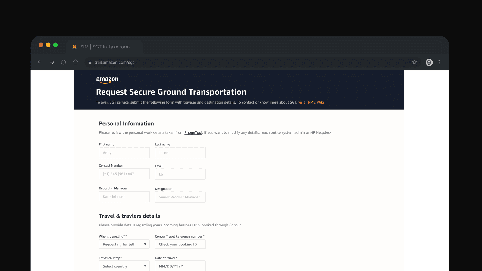
Until 2022, employees from senior leaders to individual contributors used a lengthy intake form and waited an average of 36 hours for approval. They often reached the application without knowing the acceptance criteria. A form submission began a coordination process rather than giving the traveller a clear route to confirmation.
The problem was shared by two audiences: travellers trying to arrange a trip and the operations team interpreting requests, handling questions, and working with transportation providers. Improving one screen would not be enough if the manual work around it stayed the same.
 View full size
02My role
Bring business, engineering, and traveller needs into the same conversation.
I led the design work from research and conceptualisation through usability testing and developer handoff. My partners included the TRM business manager and team, a technical project manager, a UX lead, a tech lead, and two software development engineers.
I started by bringing TRM and engineering into the same discussions. We examined the business challenges, technology gaps, delivery constraints, and opportunities to improve the service. This was important because the experience depended on operational rules and coordination as much as interface design.
Together we framed the goals: simplify booking and request management, reduce manual coordination, improve communication, and help travellers understand when and how to use SGT. These goals provided a basis for deciding what belonged in the MVP.
03Discovery
Map the journey before rewriting the form.
With TRM and engineering, I arranged interviews with past travellers and mapped the existing customer journey. The mapping captured stages, goals, frustrations, motivations, and the points where people needed help. It helped connect a traveller’s uncertainty to the extra work arriving in the operations team’s queue.
The important questions were practical. Could someone establish whether their destination was covered before entering the full itinerary? Could they understand the status of a request without contacting support? Could they change or cancel a booking themselves?
These questions became design opportunities and helped define scope and success measures. They also kept the work focused on the whole request lifecycle: create, view, update, and cancel.
04Design decisions
Make the service understandable before asking people to commit.
Across more than five brainstorming sessions and over ten scope and design iterations, I worked with the team to balance impact, feasibility, and future scale. The resulting direction brought eligibility, booking, and request visibility into a connected journey.
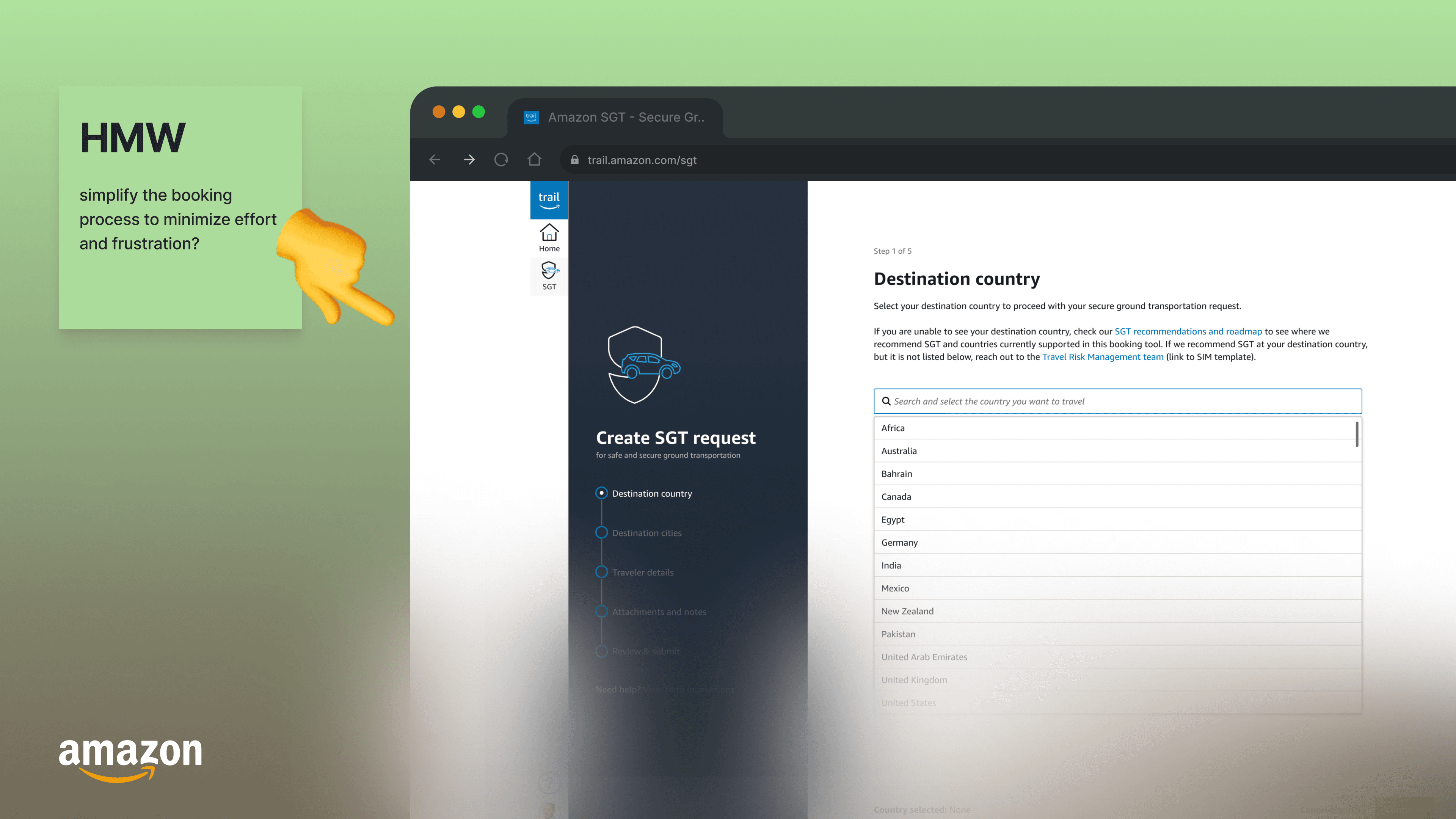
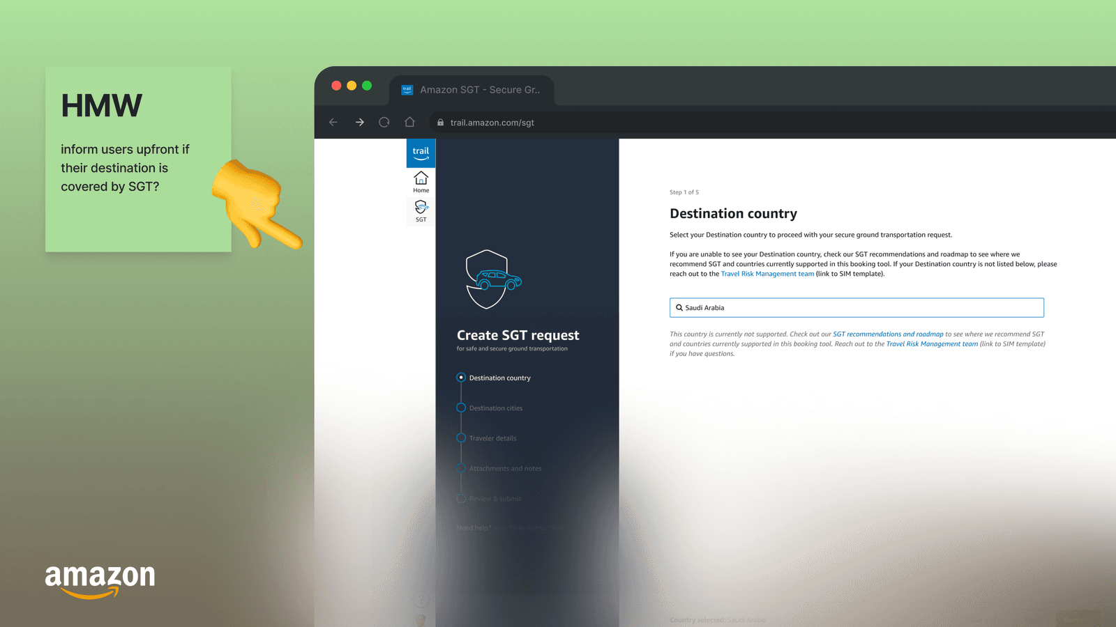
Put destination eligibility at the beginning
The old experience made acceptance criteria unclear. Bringing the destination check forward meant a traveller could establish service coverage before investing time in the rest of the booking.
Break the intake into a guided sequence
A progressive booking flow gave each stage a clearer purpose. Destination and eligibility led into traveller and itinerary details, including the information needed for multi-city trips.
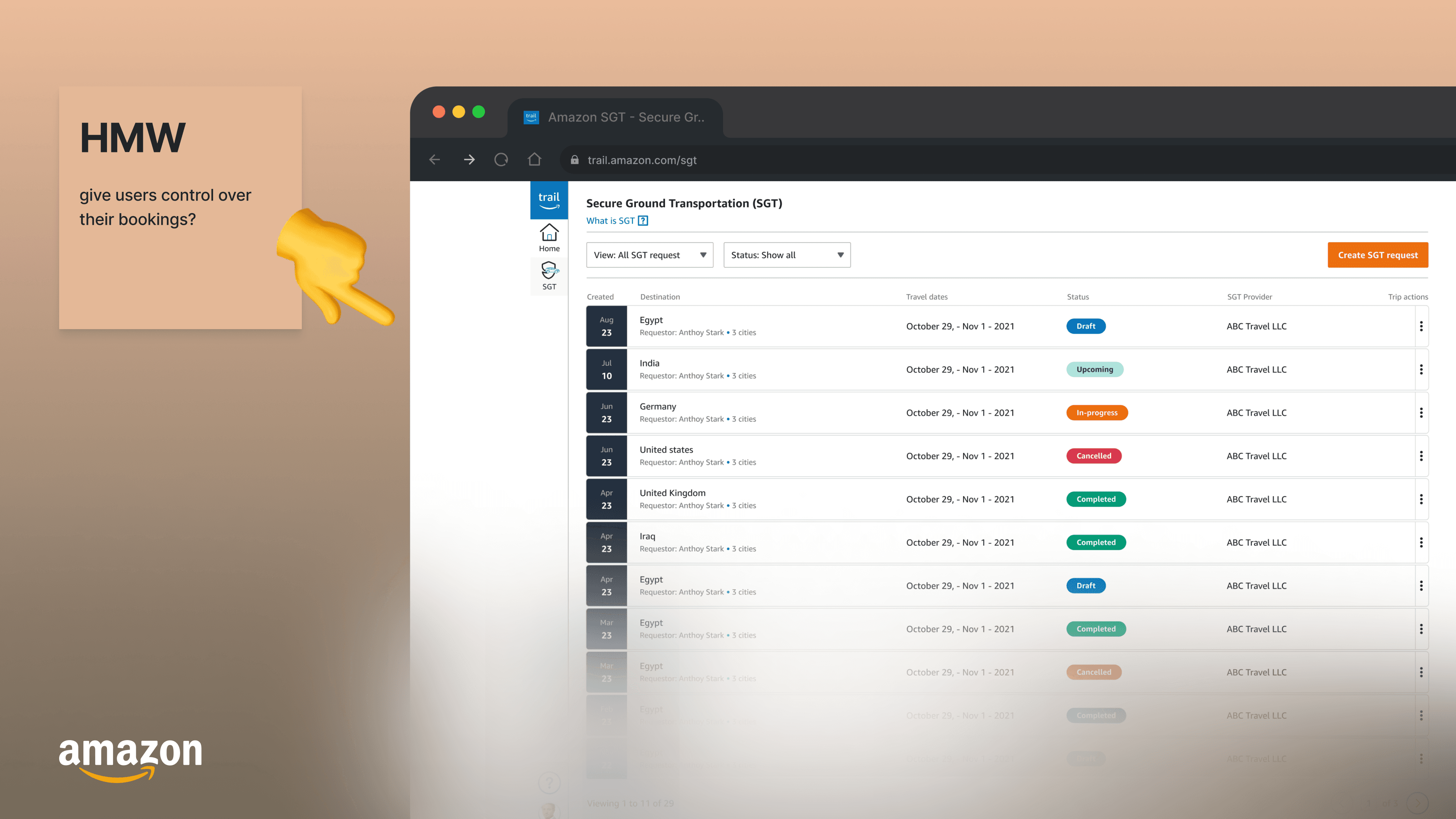
Give requests a place to live after submission
A dashboard made existing bookings and their status visible. The experience continued after the form was sent, reducing the need to ask another person what was happening.
Make routine changes part of the product
Viewing, updating, and cancelling requests belonged in the same lifecycle. Self-service actions and relevant cancellation information reduced dependence on separate coordination.
 View full size
 View full size
05Validation & delivery
A user-validated MVP, tested in a controlled pilot.
More than five usability studies informed the final MVP. The delivered experience covered first-time guidance, a request dashboard, destination selection, eligibility feedback, booking details, and cancellation. Some opportunities were deliberately held for later releases to keep the initial scope feasible.
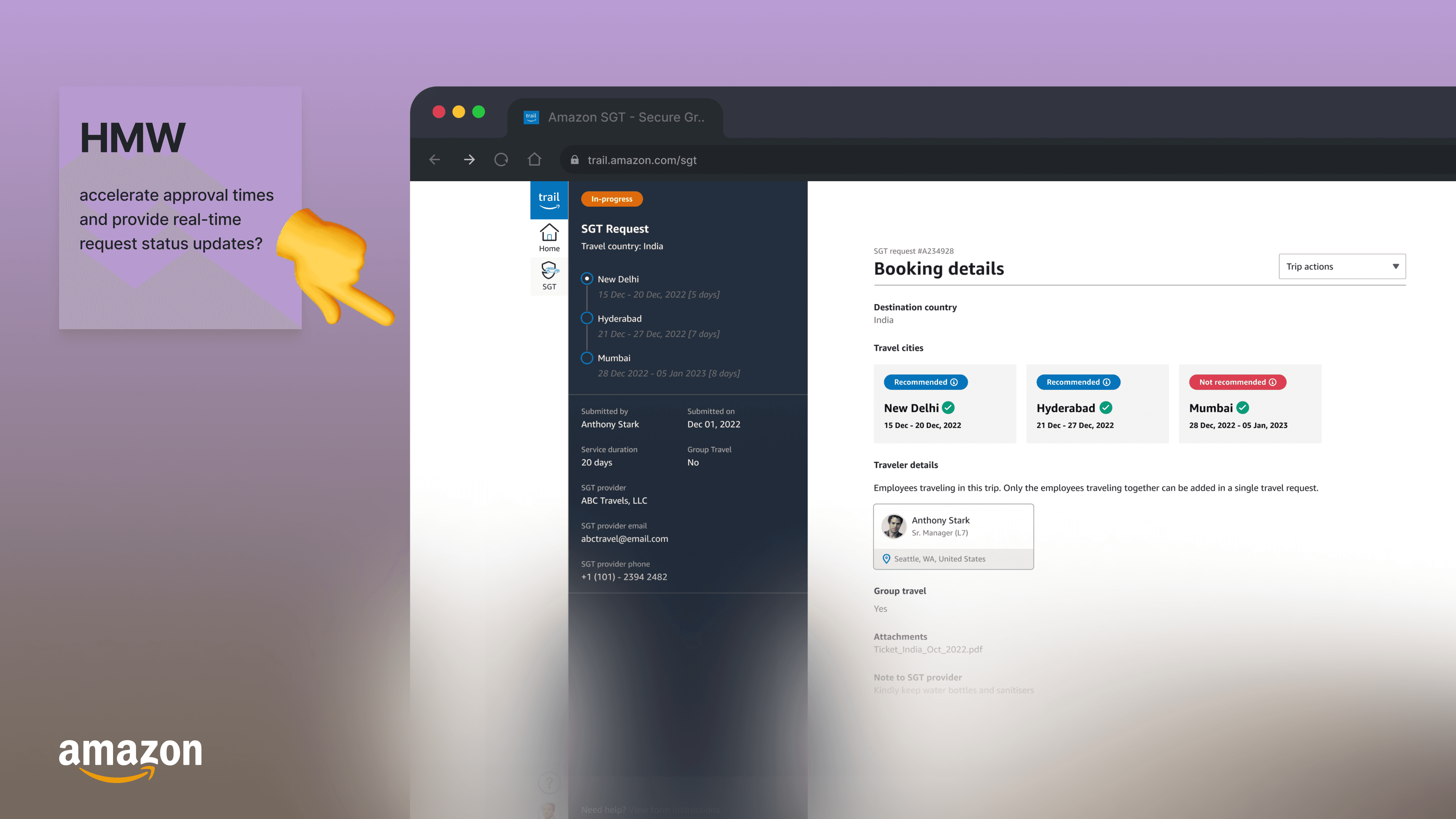
The booking details supported traveller information and multi-city requirements. Save as draft was useful for people who needed to return to a request. The dashboard and self-service actions gave the booking a clear state beyond submission.
The MVP began with a controlled pilot in one country before scaling globally. This gave the team a bounded setting in which to learn about the product and its operational handoffs before extending the service.
 View full size
 View full size
06Outcomes
Less waiting, less uncertainty, and less support work.
Average time from initial request to confirmation fell from 36 to 18 hours, a 50% reduction in elapsed service time. More than 80% of low-risk requests received approval within 15-30 minutes, reducing manual TRM intervention.
Unique travellers booking SGT increased by more than 30%. Support enquiries related to booking confusion, pricing, and eligibility fell by more than 50%. These outcomes connected the interface changes to both traveller adoption and the operations team’s workload.
07Lessons & next steps
The MVP improved booking. The journey still continued outside it.
The first release exposed where the next investment should go. Our reflections became a new set of user stories for access, integration, and communication.
Access matters most away from the desk
The launch ran on Amazon’s secure desktop network. That made it difficult to use at moments such as airport arrival. WhatsApp connected travellers and providers as a pragmatic workaround, while mobile access remained a priority.
Use the itinerary the traveller has already entered
Save as draft helped, but it did not remove repeated data entry. A proposed SAP Concur integration would allow a booking ID to retrieve existing trip details. This was a next-step opportunity, not a shipped MVP capability.
Bring communication back into the request
WhatsApp kept coordination moving but scattered the conversation. In-product chat within the request was identified as a way to improve continuity, transparency, and tracking.
Scale with local realities in mind
The one-country pilot was the beginning of a wider rollout. Subsequent work needed to address mobile use, automation, deeper integrations, and the requirements of individual geographies.