01Context & scope
A missed recharge exposed the gap between automatic tolls and manual top-ups.
In Dubai, drivers pass through electronic toll gates without stopping. Salik deducts the road-toll charge from a prepaid account associated with the vehicle’s tag. The driver still needs to keep that account funded. RAKBANK, a UAE bank, offered a way to recharge it through digital banking.
At the time, a standard crossing cost AED 4. A driver could pass through a gate with insufficient credit, but needed to recharge within a five-day grace period to avoid an insufficient-funds violation. The AED 50 fine, limited to one violation per vehicle per day, made a missed recharge a recurring financial risk.
The incident that set the brief.
The brief began with a missed recharge experienced by RAKBANK’s CEO. He had assumed there was enough credit in his Salik account and discovered roughly two to three weeks later that fines had accumulated. The incident exposed the fragility of relying on busy drivers to monitor a prepaid balance and act on SMS reminders.
The CEO briefed the E-Channels Head and Head of Design. I was then assigned to lead the design and implementation of the AutoPay journey, working with Salwa S and Anthony H, Head of UX. The brief included validating the experience with the bank’s Salik users and resolving usability issues before launch.
Turn a recurring task into a clear, controllable instruction.
AutoPay moved this from a repeated manual task to a standing instruction: when the Salik balance fell below a chosen threshold, a selected amount would be transferred from the customer’s funding account. The UX challenge was making that automation understandable, discoverable and controllable.
Sets the instruction
Chooses when to recharge, how much to add and which account to use.
Funds the Salik account
Uses the saved AutoPay rule to initiate a recharge.
Collects the road toll
Deducts the toll charge from the prepaid balance as the vehicle passes a gate.
This connected product design with service design. The app had to explain the instruction; the wider experience had to make sense across balance changes, bank payments and toll-account updates. A customer could complete every screen correctly and still misunderstand what the service would do.
Design within the existing architecture
The scope was the AutoPay journey, not a full banking-app redesign. The established top headers and bottom navigation remained in place. The intervention focused on task entry, information hierarchy, selection states and confirmation.
Make automation legible
The design objective was to reduce the effort of remembering a recharge without obscuring the customer’s financial commitment. Discoverability, comprehension and user control mattered together.
02Competitive context
Automatic top-up was the category baseline. Control was the design opportunity.
Comparable Salik services put the interaction problem in context. Emirates NBD and Emirates Islamic both describe credit-card-funded automatic top-ups. The relevant comparison is how clearly each service exposes the funding relationship, the trigger and the ability to change or stop it, not simply whether an AutoPay feature exists.
| Service pattern | Documented approach | UX implication |
|---|---|---|
| Emirates NBD ↗ | Credit-card-funded Salik top-up with a defined balance trigger and selectable recharge amounts. Activation, amendment and cancellation are distinct actions. | A complete automation journey must expose the ongoing instruction, not only first-time setup. |
| Emirates Islamic ↗ | Card-linked top-up plans with defined thresholds and amount choices; its support guidance describes assisted activation and cancellation. | Setup convenience and later control are separate service touchpoints. Channel changes can add customer effort. |
| RAKBANK AutoPay | Trigger, recharge amount and funding account configured within the existing mobile-banking journey. | Bring the rule and its saved state together; distinguish a beneficiary edit from a recurring-payment instruction. |
Product-pattern comparison based on published service descriptions and the RAKBANK project artifacts. The UX implications are design analysis, not results from comparative user testing.
03Usability findings
Usability testing exposed a mismatch between the interface and customers’ expectations.
The executive incident established urgency. Usability testing grounded the interaction decisions in customers’ behaviour: could people find AutoPay, understand the instruction and change it confidently?
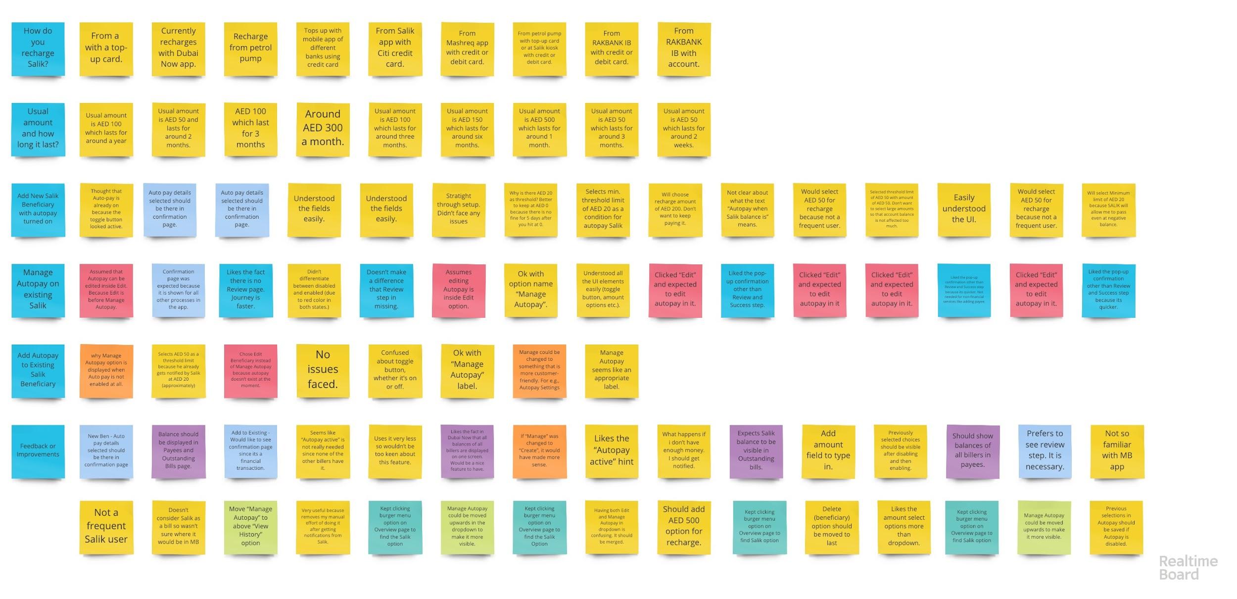
We evaluated three core tasks with nine Salik users at RAKBANK in Dubai. All owned cars; six were frequent Salik users. Their digital-banking experience ranged from low to high, giving us different levels of familiarity with banking terminology and interaction patterns.
Add a new Salik payee
Create the beneficiary with AutoPay enabled.
Revise an instruction
Change AutoPay settings already in place.
Enable for an existing payee
Find the feature and switch it on.
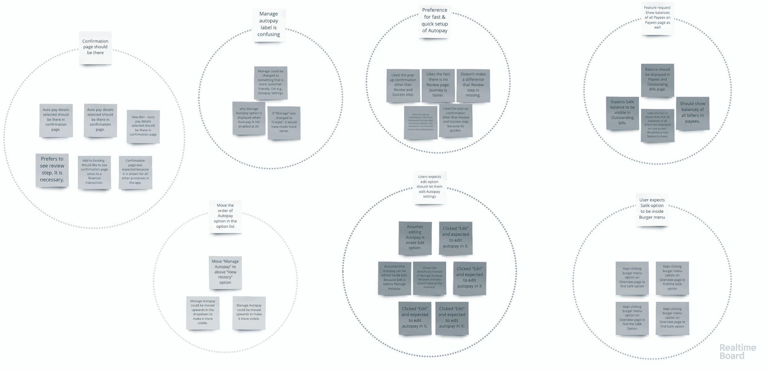
The qualitative synthesis centred on observed task behaviour: where people looked, what they believed a control meant, and which information they needed before committing. Four issues shaped the design priorities.
Discoverability: the labels conflicted with the customer’s mental model.
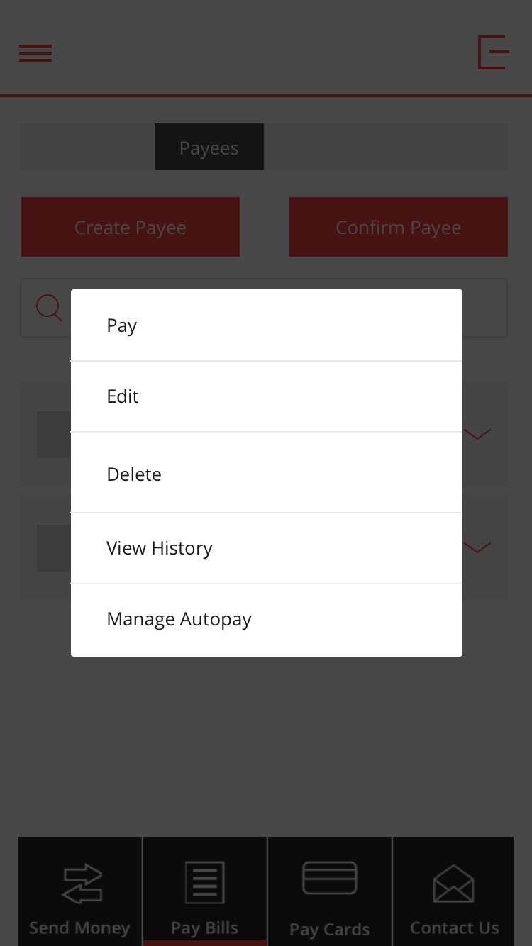
When asked to change AutoPay, participants opened “Edit” instead of “Manage Autopay”. Beneficiary details and payment instructions were separate in the interface, but customers treated them as part of the same task.
Design implication: distinguish the two actions at the point of choice.State visibility: an inactive control looked active.
The switch used red in both states. Participants thought AutoPay was already on or struggled to tell whether it was enabled. In a recurring-payment journey, this ambiguity could create false confidence.
Design implication: communicate saved status through words as well as colour.Cognitive load: the payment rule lacked context.
Participants wanted their Salik balance alongside the payee, visible amount choices, and their selected settings at confirmation. They also expected previous choices to remain when turning AutoPay back on.
Design implication: support recognition and keep the complete instruction visible.Recoverability: setup did not answer what happened next.
An insufficient-funds question exposed a service concern beyond the form: how would a customer know a recharge had failed, and what should they do?
Design implication: separate instruction status from payment status.“What happens if I don’t have enough money in my account? I should get notified.”
Participant feedback during usability testing
04Customer journey
One customer goal. Several moments where trust could break.
The customer’s goal was to keep driving without repeatedly remembering to recharge. This journey map connects that goal to the decisions, friction and service dependencies around AutoPay.
Keep the toll account funded.
Stay in control of the money.
Driver using Salik
Goal: reliable recharge with an understandable payment rule.
Scroll horizontally to follow all six stages.
| Journey stage | 01Find | 02Understand | 03Configure | 04Confirm | 05Manage | 06Recover |
|---|---|---|---|---|---|---|
| Touchpoint | Payee list + action menu | AutoPay state | Recharge settings | Review + confirmation | Saved instruction | Payment status + support |
| Customer action | Identify the right Salik payee and locate AutoPay. | Determine whether automatic recharge is already active. | Choose the trigger, amount and funding account. | Check the selected instruction before committing. | Change, stop or re-enable AutoPay. | Understand an unsuccessful or unconfirmed recharge. |
| Customer concern | “Where do I change this?” | “Is it actually on?” | “When will money move?” | “Have I chosen correctly?” | “Can I stay in control?” | “Was I charged?” |
| Pain point | Edit Beneficiary and Manage AutoPay compete with the customer’s mental model. | Red in both switch states creates a misleading affordance. | Missing balance context increases the effort of evaluating the rule. | Customers want a short journey and enough detail to verify their choices. | Losing previous settings would create avoidable re-entry and uncertainty. | An active instruction does not explain a failed or unconfirmed payment. |
| ConfidenceQualitative interpretation | ||||||
| Design opportunity | Pair nicknames with vehicle plates; distinguish one-off recharge from the recurring instruction.Recognition + information scent | Pair distinct visual states with explicit enabled / disabled labels.Visibility of system status | Expose balance context, common presets and the complete instruction.Recognition over recall | Keep selected settings visible in a concise confirmation.Error prevention | Retain readable settings and distinguish the toggle’s enabled and disabled states.User control and freedom | Distinguish confirmed failure from unknown status; explain the next action.Recoverability |
Concerns summarise research themes rather than direct quotations. The confidence curve is a qualitative design interpretation; recovery highlights a service opportunity raised during testing.
05Design decisions
Turn an ambiguous form into an understandable payment instruction.
Clarify the information architecture
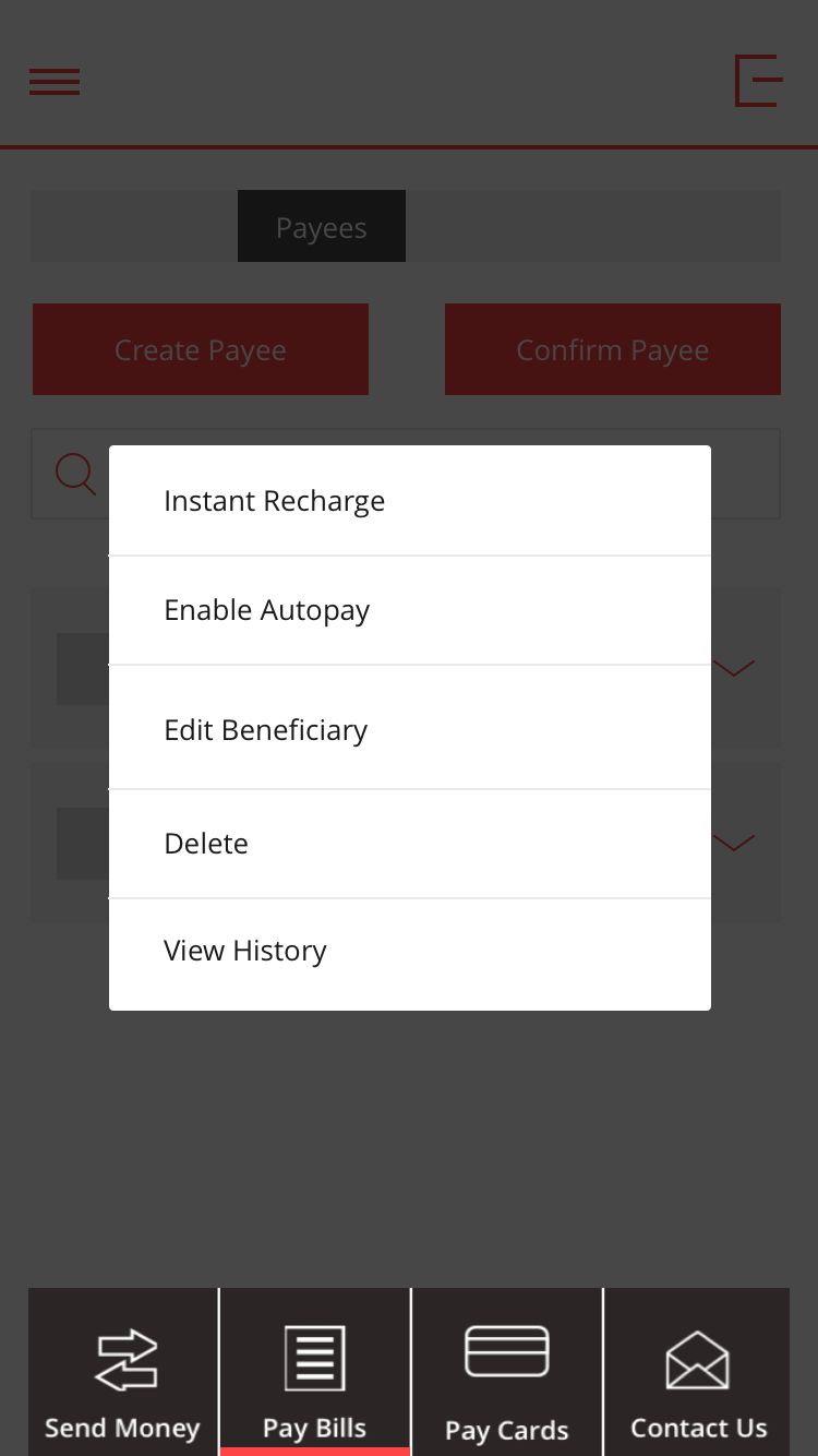
The menu labels separated “Edit Beneficiary” from “Enable AutoPay”, while “Instant Recharge” made the one-off payment action explicit. This addressed the mental-model mismatch without changing the app’s global navigation.
Principle: improve information scent at the decision point.Use behavioural data for amount presets
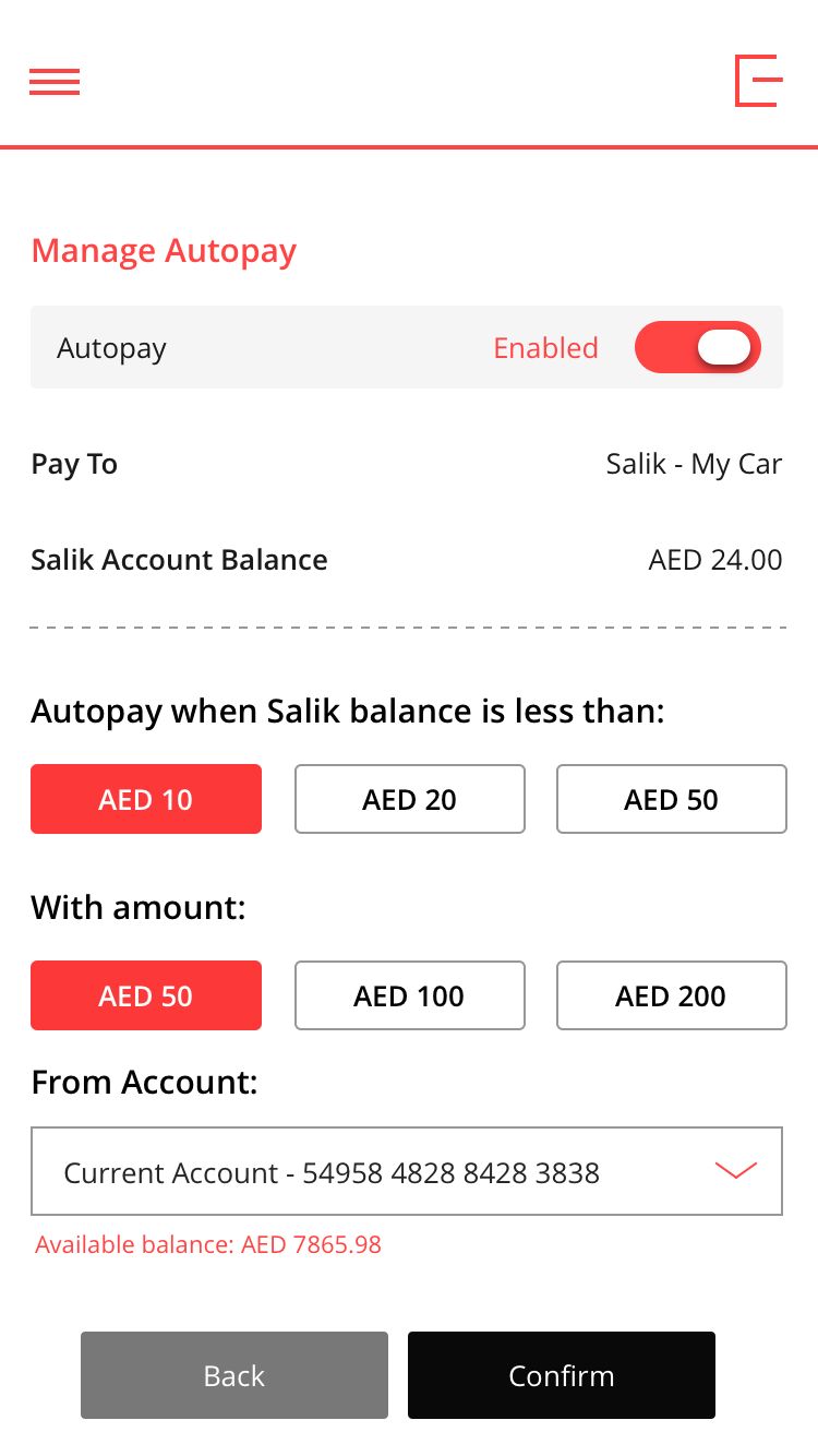
We selected AED 50, 100 and 200 using recharge records alongside participant feedback. Together, these amounts represented 21,492 of 26,155 transactions, about 82.2% of the dataset. Presets made common amounts visible and reduced reliance on a dropdown.
Principle: recognition over recall, supported by transaction behaviour.Make state visible and unambiguous
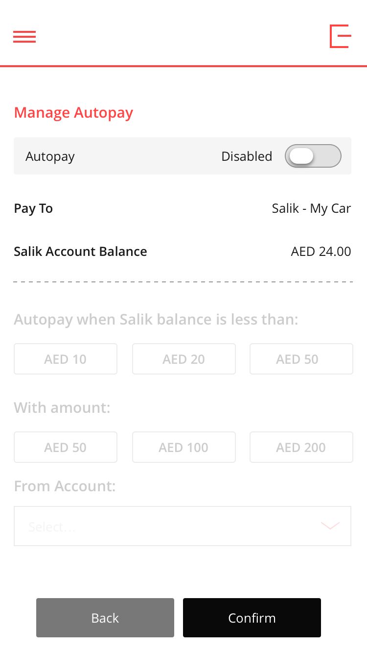
The revised switch states paired a visual distinction with explicit enabled and disabled labels. Colour alone could not carry the meaning. Customers needed to understand the saved instruction before leaving the journey.
Principle: visibility of system status and error prevention.Put financial context beside the choice
Salik balance, recharge amount and funding information belonged in the decision flow. Participants also wanted their selections at confirmation and their previous choices retained when re-enabling.
Principle: lower cognitive load while preserving customer control.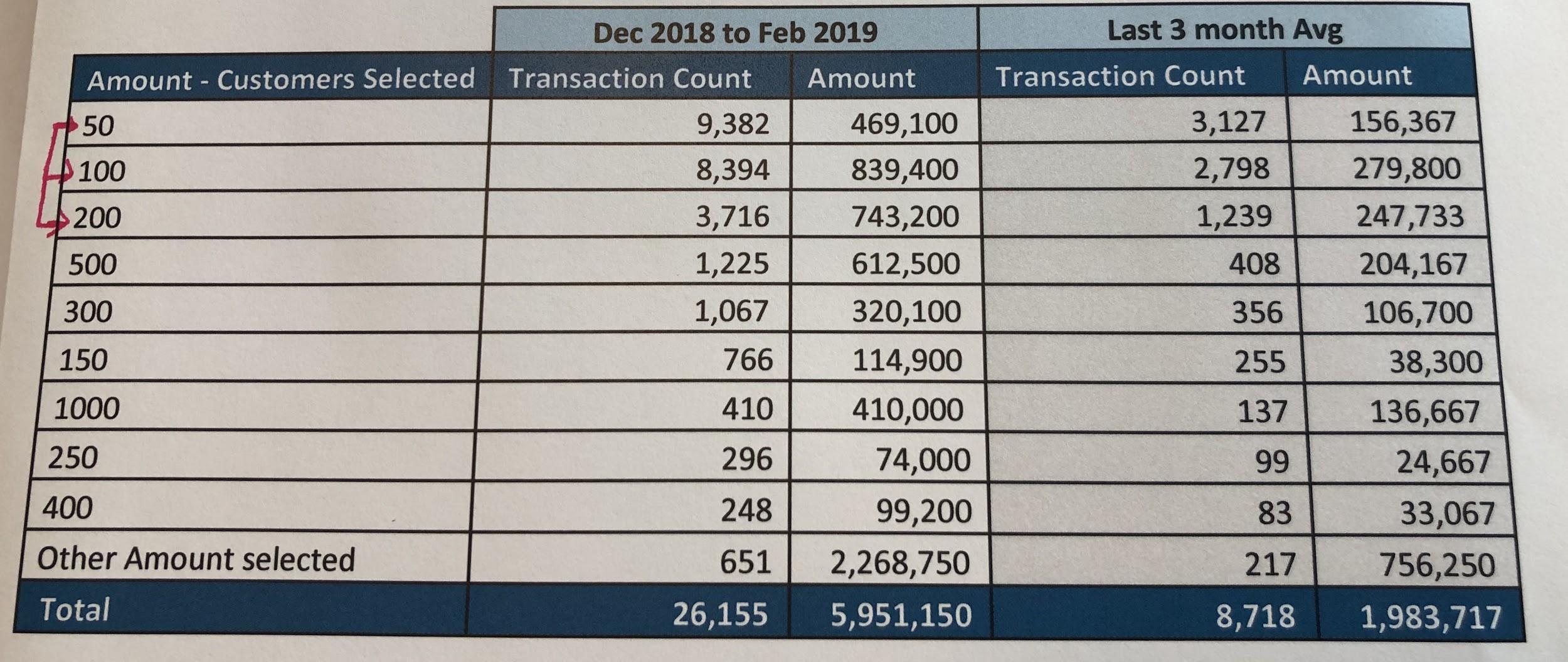 View recharge data
The trade-off: less friction, without weaker confirmation.
Some participants preferred a short popup to separate review and success pages. Others wanted to see every selection at confirmation. These needs were compatible: the critical requirement was a concise summary of the financial instruction, not an arbitrary number of screens. Trigger, amount and funding source needed to remain visible at the point of commitment.
The constraints also mattered. Recharge amounts and balance thresholds serve different purposes; the transaction distribution justified the presets, not the trigger values. A clearer interface could explain the available rules, but could not redefine the bank’s underlying payment behaviour.
06Before & after
A clearer hierarchy, from first action to saved state.
The comparison shows subtle refinements to the existing interface. The AutoPay toggle, amount presets, account selector and Back / Confirm controls remain in place. The established headers and bottom navigation are preserved. Within that boundary, refined spacing, explicit toggle states and clearer microcopy make the payment rule easier to inspect.
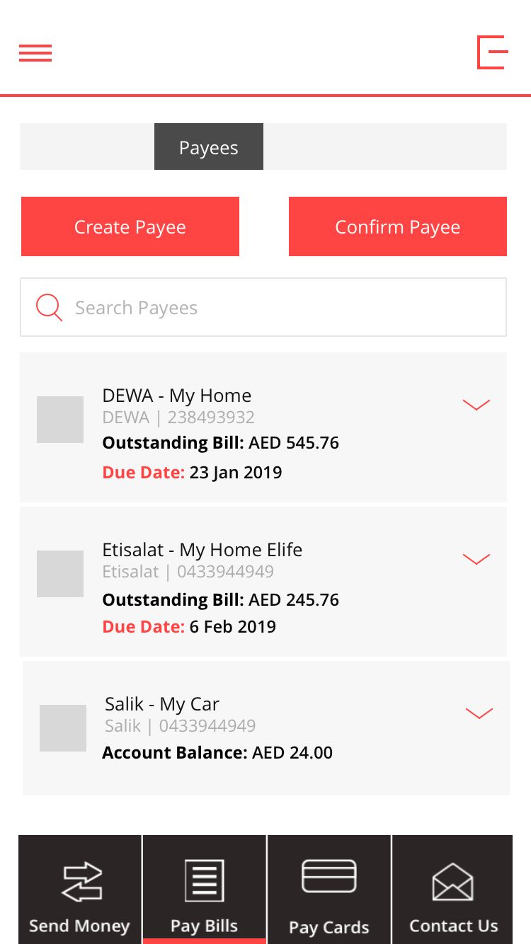
On the payee list, small service logos support scanning; unique identifiers support recognition. Salik payees pair a nickname with the complete vehicle plate, including its emirate and plate code. DEWA and Etisalat pair a recognisable label with only the last four account or service digits. The selected vehicle remains visible in setup and confirmation, reducing the risk of editing the wrong instruction when several payees exist.
Clarify the actions within the existing menu.
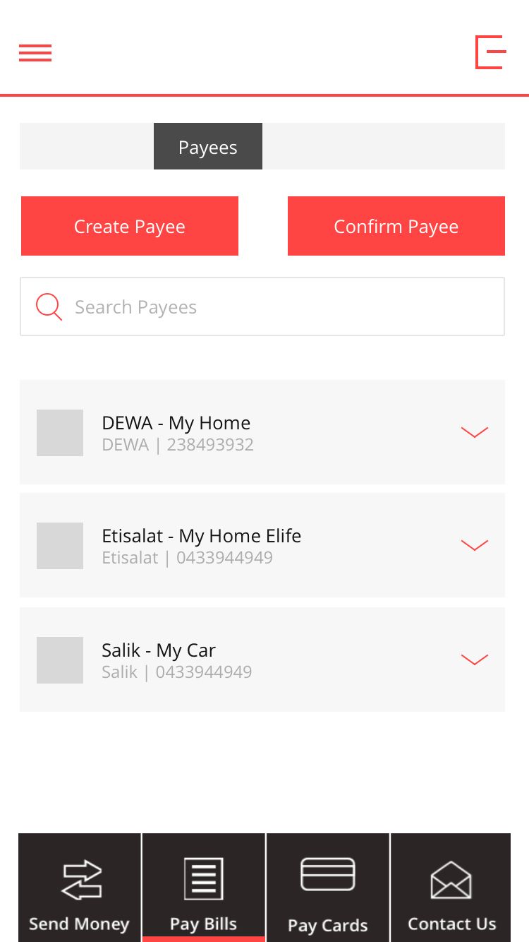

Outstanding bill: AED 545.76

Outstanding bill: AED 245.76

Account balance: AED 24.00
Account balance: AED 42.00
- Finding
- Customers selected Edit when they wanted to change AutoPay.
- Design response
- Keep the menu pattern. Distinguish Instant Recharge, Enable AutoPay and Edit Beneficiary through specific action labels.
- Trade-off
- Improves information scent without introducing a different navigation pattern.
View the original design iterations
The project artifacts show the changes to action labels, balance information, switch states and amount choices that preceded validation and launch.
Portfolio prototype with illustrative data. Original screens are unchanged; refined screens are redrawn for presentation.
07Service experience
The experience continued after the customer tapped Confirm.
The product interface was one part of a larger service. Saving an instruction, debiting the funding account and crediting Salik were different events. The participant’s insufficient-funds question made that distinction tangible: an “AutoPay on” message could not stand in for a successful recharge.
| Service moment | Customer needs to understand | Design responsibility |
|---|---|---|
| Instruction saved | Which rule is active and how to change it. | Confirm the saved settings and distinguish them from unsaved edits. |
| Recharge initiated | Whether money is moving and whether action is needed. | Communicate payment status without implying that toll-account credit is already confirmed. |
| Recharge unsuccessful | Whether a debit occurred, why the recharge failed and what to do next. | Offer a recovery action that matches the confirmed service state. |
| AutoPay switched off | What stops, which settings remain and whether a payment is already in progress. | Separate future instructions from payments already underway. |
Service implications of the journey. The illustrative states below explore recovery beyond the original screen set.
Explain the cause and the next action.
Recharge unsuccessful
Your bank account did not have enough available funds. No money was taken.
Last known balance. Check your Salik account before driving.
- Attempted recharge
- AED 100
- From account
- Current account ·· 3838
- Payment status
- Failed · confirmed
Changing the funding account updates future payments. It does not retry this recharge.
Avoid encouraging a duplicate payment.
Recharge confirmation pending
The payment service has not confirmed the result yet.
- When Salik balance is below
- AED 20
- Recharge amount
- AED 100
- From account
- Current account ·· 3838
A second attempt could recharge twice. Check the payment status before making another payment.
Make recovery specific
An insufficient-funds message should identify the problem and the relevant funding account. Changing that account is a settings update; it should not silently imply that the failed recharge has been retried.
Respect uncertainty
An unconfirmed result is not a confirmed failure. The interface should explain the pending status and prevent an uninformed second attempt. This is where interaction design depends on reconciliation, notifications and support handoffs.
08Validation & launch
Validated with the bank’s Salik users. Then launched.
We validated the revised journey with Salik users of the bank before launch. The delivered work addressed the usability issues through clearer action labels, visible balance context, distinct enabled and disabled states, and amount presets grounded in recharge behaviour.
Clearer task entry
Separate payee editing, one-off recharge and AutoPay management.
A legible instruction
Make the trigger, amount, funding source and current state understandable.
A focused release
Improve the journey within the established app structure, following user validation.
My central learning was that automation changes the nature of user control. Customers perform fewer repeated actions, but need a stronger mental model of what happens on their behalf. In financial journeys, effective UX connects discoverability and efficient task completion with clear consent, visible status and recoverability.
Project credits & references
- Design and implementation lead: Zohdi Rizvi. Collaborators: Salwa S and Anthony H, Head of UX, RAKBANK.
- Salik: how the road-toll service works ↗
- Project context: Dubai’s published toll and fine schedule ↗ and recharge grace-period rules ↗. The amounts in this case describe the service at the time of the project.
- Competitive context: Emirates NBD ↗ and Emirates Islamic ↗ published service descriptions. The comparison examines service patterns and their UX implications.